Essential Guide to How to Find the IQR
Understanding IQR and Its Definition
The **Interquartile Range (IQR)** is a fundamental statistical measure that quantifies the variability of a dataset by dividing it into four equal parts. Understanding IQR is crucial for anyone involved in **data analysis**, as it provides insights into the middle 50% of a dataset, allowing for more robust comparisons. This is essential when assessing spread and central tendency alongside other measures like the range and variance. Calculating the **interquartile range** allows us to highlight how diverse the data can be, particularly when dealing with skewed distributions or outliers. Thus, gaining a definition of IQR is a foundational step before moving on to practical applications of this important statistic.
What Are Quartiles in Statistics?
**Quartiles in statistics** are specific values that divide a ranked dataset into four equal parts. The **first quartile (Q1)** represents the 25th percentile, the **second quartile (Q2)** (which is also the median) marks the 50th percentile, and the **third quartile (Q3)** corresponds to the 75th percentile. The IQR itself is determined by subtracting Q1 from Q3 (IQR = Q3 – Q1). This calculation method provides a concise overview of the dataset’s central values while ignoring extreme values that may skew the overall mean. Visualizing IQR on graphs or in box plots allows one to quickly see where the bulk of data resides, aiding in analysis and interpretation.
Importance of IQR in Data Sets
Understanding the significance of the IQR in data sets cannot be understated. It is particularly valuable because it focuses on the spread of the central portion of the data rather than being heavily influenced by outliers. This robustness makes the IQR a preferred choice for analyzing data distributions, especially in research contexts. The IQR is also a key component in **outlier detection**, often used in box-and-whisker plots to graphically depict the distribution while identifying values that lie far outside the typical range. Ultimately, leveraging IQR enables analysts to make informed decisions based on statistical evidence.
Calculating the IQR: Step-by-Step Process
Knowing **how to calculate IQR** is essential in data analysis to derive accurate conclusions from your datasets. The steps involved in the calculation need to be clearly followed to ensure precision in results. This section will outline the process, along with a common **IQR example problem** to visualize its application.
Step-by-Step Calculation Method
To effectively compute the **interquartile range**, follow these four basic steps. First, arrange your data in ascending order. Next, find the first quartile (Q1) by identifying the median of the lower half of the dataset, then find the third quartile (Q3) by identifying the median of the upper half. The final step involves subtracting Q1 from Q3—this difference is your IQR. For instance, consider the dataset: 3, 7, 8, 12, 14, 15, 18. Ordering this set leads to Q1 = 7 and Q3 = 15. Thus, calculating the IQR gives us 15 – 7 = **8**. Using this simple method allows anyone to efficiently derive this metric.”
Example Problem: Finding the IQR
Let’s consider an example where you need to find the IQR in a dataset representing exam scores: 45, 55, 65, 70, 75, 80, 85, 90, and 95. After **calculating quartiles**, we arrange the scores in ascending order to facilitate finding Q1 and Q3 easily. The first quartile (Q1) here would be the average of the second and third values (55 and 65), giving us a Q1 of 60. Meanwhile, Q3 would be the average of the seventh and eighth values (85 and 90), yielding a Q3 of 87.5. Therefore, IQR = Q3 – Q1 = 87.5 – 60 = **27.5**. The measure of **IQR in this context highlights exam score dispersion**, enabling educators to perceive student performance distribution more clearly.
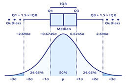
IQR in Box-and-Whisker Plots
Understanding how IQR interacts with **box and whisker plots** is critical for visual data analysis. These plots succinctly display the distribution of a dataset, effectively summarizing the information captured by the IQR. When using box plots, the IQR is visually represented by the length of the box drawn from Q1 to Q3.
Visual Representations of IQR
In a box-and-whisker plot, the box represents the IQR, showcasing the central data spread. The “whiskers,” which extend from the edges of the box, indicate variability beyond the quartiles, including either the minimum or maximum values of the dataset. The IQR, thus, clearly displays where the majority of the data points lie while also making outliers visible. For instance, using a dataset with extreme values can significantly affect the range but not the IQR, thereby reinforcing its advantage in specific statistical applications.
Misconceptions About IQR
There are various misconceptions surrounding IQR that can mislead users. One common misunderstanding is equating IQR to range; they are distinct statistical measures. While the range compares the highest and lowest data points, IQR specifically focuses on the central 50% of values, offering a more reliable reflection of a data set’s variability. Moreover, some might overlook the significance of IQR when working with skewed distributions or in **outlier detection**—this neglect can lead to skewed analyses and questionable insights. Thus, understanding the IQR thoroughly empowers users to defend their data interpretation confidently.
Practical Applications of IQR in Statistics
The IQR is utilized in a plethora of ways within the realms of data analysis and research. Its applications touch on various fields, aiding analysts in making statistically sound conclusions from datasets that may otherwise be misinterpreted.
Using IQR for Data Analysis
In data analysis, the IQR helps summarize extensive datasets succinctly, establishing a criteria for data integrity—informing which values within a dataset can be classified as outliers. Researchers widely adopt this method particularly for datasets representing extreme occurrences, helping to maintain reliable standards in analysis. Characteristics of IQR function especially well in **scientific research** where large datasets are common, allowing analysts to discern pivotal information without being swayed by statistical aberrations.
IQR Usage in Predictive Modeling
In terms of predictive modeling, utilizing IQR effectively assists in reducing dimensionality and enhancing model performance. When conducting classification or regression tasks, identifying significant features through IQR can improve model efficiency and accuracy. For instance, IQR not only identifies non-informative features but also solidifies reliable relationships among data points—this shines particularly true when dealing with structured data or complex datasets encountered within **machine learning** environments. Thus, the practical applications of IQR extend far beyond mere calculations, reaching pivotal roles in systematic analyses.
Key Takeaways
- The IQR provides critical insights into the variability of a dataset by summarizing the middle 50%.
- Understanding and calculating IQR correctly empowers analysts to make informed decisions, particularly by addressing outliers and skewed distributions.
- Visual representations such as box-and-whisker plots leverage IQR effectively, emphasizing the significance of statistical values and ensuring sound interpretations.
- IQR has broad practical applications across various fields in data analysis and predictive modeling, cementing its importance in processing statistical data.
FAQ
1. What is the significance of IQR in statistics?
The IQR is significant in statistics as it helps identify the middle range of a dataset, making it useful for understanding data spread. It provides insight especially in presence of outliers, maintaining accuracy in interpretations facilitating sound statistical applications.
2. How does IQR differ from the regular range?
Unlike the regular range, which calculates the difference between maximum and minimum values, the IQR specifically assesses the spread of the middle 50% of data points. This makes IQR a more reliable metric in skewed distributions, focusing on central tendencies instead of extremes.
3. Can IQR be used to detect outliers?
Yes, IQR is a viable method for detecting outliers. Typically, any data point beyond 1.5 times the IQR from the quartiles can be classified as an outlier. This calculation method provides a straightforward means of identifying atypical values within datasets.
4. What role does IQR play in data visualization?
IQR plays a crucial role in data visualization, particularly through box-and-whisker plots, which graphically represent the variability and distribution of data. This allows for quick assessment of data spread and identification of potential outliers visually.
5. In what ways can IQR be applied in real-world situations?
In real-world situations, IQR can guide decisions across various fields like education for assessing student performance, finance for risk assessment, and healthcare research for analyzing patient data effectively—ensuring data is interpreted accurately within context.
6. Is there software available for IQR calculations?
Yes, many statistical software tools like R, Python, and Excel can automate IQR calculations. Utilizing software simplifies the process significantly, especially for those working with substantial datasets requiring accurate and swift analysis.